The seat map in Markoub.ma is structured as a multi-dimensional array, representing the bus layout in rows and columns. Each item in the seat map corresponds to a specific seat or space within the bus, with detailed attributes defining the seat’s availability and status. Below is an explanation of the data returned by the seat map endpoint, the different seat types, and how they are organized.

Seat Map Structure

The seatMap is a two-dimensional array where each nested array represents a row in the bus, and each item within these rows represents a specific seat or space. Each seat or space has:
  • type: Defines the seat’s availability or function (selected, available, reserved, empty, closed).
  • index: A unique identifier based on the seat’s row and column position in the bus.
  • seatNumber: The actual seat number for the bus, where 0 typically indicates a non-seating space.
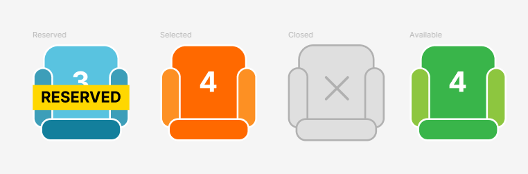
Seat Types

The seat map endpoint supports several types of seats, which are detailed below:
  • selected: The seat has been preselected by the system and appears in the selectedSeats array. Users can see it as preselected, but they can select another seat if desired.
  • available: The seat is available for selection. Users can choose this seat when booking.
  • reserved: The seat is temporarily reserved for another customer, awaiting confirmation. It is currently unselectable by other users until it becomes available again.
  • empty: Represents a non-seating area, such as the aisle or walkway within the bus.
  • closed: The seat is unavailable for selection, either due to being permanently closed or unusable for this journey.

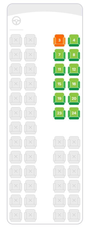
Example Seat Map Data

{
  "selectedSeats": [
    {
      "seatNumber": 12,
      "index": "3,5"
    }
  ],
  "seatMap": [
    [
      {"type": "closed", "index": "1,1", "seatNumber": 1},
      {"type": "closed", "index": "1,2", "seatNumber": 2},
      {"type": "empty", "index": "1,3", "seatNumber": 0},
      {"type": "closed", "index": "1,4", "seatNumber": 3},
      {"type": "closed", "index": "1,5", "seatNumber": 4}
    ],
    [
      {"type": "closed", "index": "2,1", "seatNumber": 5},
      {"type": "closed", "index": "2,2", "seatNumber": 6},
      {"type": "empty", "index": "2,3", "seatNumber": 0},
      {"type": "closed", "index": "2,4", "seatNumber": 7},
      {"type": "closed", "index": "2,5", "seatNumber": 8}
    ],
    [
      {"type": "closed", "index": "3,1", "seatNumber": 9},
      {"type": "closed", "index": "3,2", "seatNumber": 10},
      {"type": "empty", "index": "3,3", "seatNumber": 0},
      {"type": "closed", "index": "3,4", "seatNumber": 11},
      {"type": "selected", "index": "3,5", "seatNumber": 12}
    ]
  ]
}
In this example:
  • Row 1 has seats that are closed and an empty space in the middle.
  • Row 2 follows a similar structure.
  • Row 3 has a selected seat at index "3,5" (seat number 12), indicating a preselected seat.

Figma Prototype

View & Download Assets on figma

To export the below assets as SVG files, you can use the figma link to view and download the assets.

Example React Implementation

<div className="relative flex w-fit flex-col items-center justify-center overflow-hidden rounded-3xl border-[3px] border-gray-300 bg-white">
  <svg
    width="360"
    className="absolute top-0 z-10"
    height="57"
    viewBox="0 0 360 57"
    fill="none"
    xmlns="http://www.w3.org/2000/svg"
  >
    <path
      d="M0 9.53674e-07C26 5.03328e-07 13.4315 9.53674e-07 30 9.53674e-07H330C346.569 9.53674e-07 332 4.76837e-07 360 0V57C360 57 281 30 179.5 30C78 30 0 57 0 57V9.53674e-07Z"
      fill="#ECECEC"
    />
  </svg>

  <div className="mt-10 flex w-full items-center justify-between p-2">
    <Wheel />
  </div>

  <div className="flex flex-col gap-y-2 p-2">
    {seatMap.map((row, rowIndex) => (
      <div key={rowIndex} className="flex flex-row items-center gap-x-2">
        {row.map((seat, seatIndex) =>
          seat.type === "space" ? (
            <div key={seatIndex} className="size-[50px]" />
          ) : (
            <button
              type="button"
              key={seatIndex}
              disabled={seat.type !== "available" && seat.type !== "selected"}
              onClick={() => clickedSeat(seat)}
              className="flex flex-col items-center justify-end disabled:cursor-not-allowed"
            >
              <SeatModel type={seat.type as any} number={seat.seatNumber} />
            </button>
          )
        )}
      </div>
    ))}
  </div>
</div>;
Explanation:
The seatMap component creates a seating layout using an SVG for the seat map design and a grid of seat elements rendered based on seat type (e.g., available, selected, reserved). This interactive layout uses buttons to manage seat selection, while styling is handled using Tailwind CSS for layout, padding, and border configurations. The Wheel component is positioned at the top, adding another layer of detail to the seating design.
This Wheel component is an SVG graphic representation of a wheel symbol, complementing the layout and aesthetics of the seat map. The SeatModel component is responsible for rendering individual seats with specific visual indicators depending on their status. This status determines how each seat appears (e.g., different colors for available, reserved, and selected seats) and provides interactive functionality.

Final Result

Visual Layout Example

Below is an example of how the bus layout might look based on the seat types:
RowSeat 1 (closed)Seat 2 (closed)Space (empty)Seat 3 (closed)Seat 4 (closed)
1ClosedClosedEmptyClosedClosed
2ClosedClosedEmptyClosedClosed
3ClosedClosedEmptyClosedSelected
4ClosedClosedEmptyAvailableAvailable
This layout helps users visually understand where seats are available, selected, reserved, or otherwise restricted, making the selection process more intuitive.